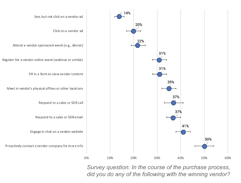
In many statistical charts, such as bar charts and line charts, there are lines that pass through a data point representing the measure in question. The bars can represent different measures, so it is important to understand which measure is being illustrated.
The most common error bars are confidence interval bars, described below. But, there are also error bars based on the standard deviation of a set of measures and of the standard error for a set of measures. Each communicates something subtly different.
Standard Error Bars
Standard error bars communicate the uncertainty in a measure. It is rare that we can account for all the factors that impact a measurement we have taken. As a result, there is virtually always a chance that if we repeat the same experiment, survey a new group of people, or measure a new event that is like the one we have just measured, we will not find precisely the same result. The standard error is a measure of that, and the standard error bar for a data point visually represents that ‘uncertainty.’
Standard Deviation Bars
Standard deviation bars illustrate the size of the standard deviation for a measure. See here for a definition of standard deviation.
Confidence Interval Bars
In the chart below, the horizontal bars passing through each of the data points (blue dots) represents the 95% confidence interval for that measure. Note that when comparing averages across groups or other factors, each measure will have a unique confidence interval.


